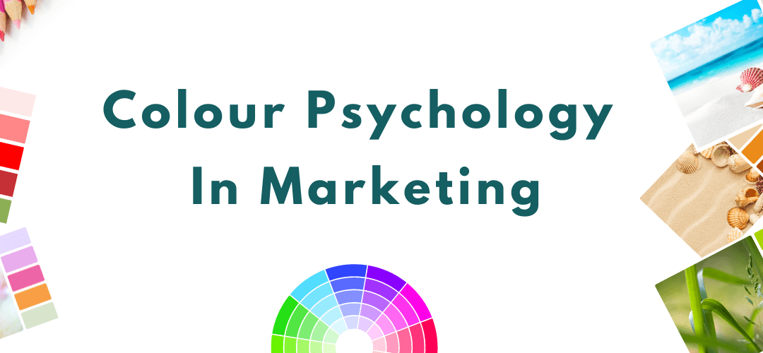
Why Colour Psychology matters in your marketing. Why the use of colour psychology in marketing is a million-dollar business.
Colour psychology is used in everything we buy from confectionary to shampoo, holidays to electrical appliances. In fact, choosing the right colour for your business brand is one of the biggest customer attraction investments that most companies make. The psychology of colour in marketing is a very powerful way to capture and engage the conscious and subconscious emotions of your ideal clients.
Now colour psychology is not just about the actual colour but can also refer to the tone or shade of the colour and the actual energy and emotions a combination of tones and shades of colour evokes in a person. That is why colour plays a big part in spiritual archetypal branding and marketing.

Colour Psychology, Colour Healing, Colour Therapy
Colour affects our mood, it can also impact our health and well-being. It also deeply affects our unconscious buying and decision-making.
Carefully chosen colours in marketing and branding are used to evoke and manipulate our emotions, and our impulses every single day. In-fact colour will often play a big part in why we buy one product or brand over another.
That is why every business should carefully consider the colours it uses in its branding or logo. Why even spiritual businesses should consider carefully the colours of their branding and marketing.
But too often, coaches and therapists just go with colours they like or are attracted to. Like every business, you should consider what colours resonate with what you do and with your audience. That is why I combine spiritual and archetypal marketing with colour psychology in my work with clients.
Colour Psychology In Branding And Logo Design
Your logo and branding are there to sell what you offer and if you’re a healer or coach it is there to sell you. If the colours and design don’t match up with what you offer and don’t resonate with your unique healing or coaching traits or style, you won’t attract the right potential clients.
Most marketing is now online, so your logo and branding are often the first impressions someone has about you and what you offer. If you use the right colours, in the right way it can seriously create a powerful positive marketing message. The wrong colours in your branding and marketing can actually repel your ideal clients and soul clients.
Let’s take a closer look at the basics of colour psychology in the marketing and branding of multinational companies. And identify why these major companies may have used the colours they have.
Influence Of Colour – Colour Psychology In Marketing

Colour Psychology Of Red
Red is used by Coca-Cola, McDonald’s Red Cross, Virgin and YouTube it is used to convey passion, energy and taking action, red is very much a stimulant to the heart and appetite so has to be used very carefully the reason it is often broken up with another colour.
Although red is associated with the root chakra, red should be used with a lot of caution in the holistic and spiritual industry unless you are a Rebel Brand or Creative Brand. Red can come across as quite aggressive and quite unsightly if not produced by a professional or someone with a good eye.
When red is mixed with white to create pink, it is widely used by more feminine brands such as the Romantic or Lover Brands, while brighter pinks are more commonly used in more Entertainer brands.
Colour Psychology Of Orange
Orange is used by Amazon, Fanta, Easy Jet, Insanity, Orange and companies aimed at the teenage or child market. The colour orange is used to convey affordability, comfort, fun and vitality. Orange can be a useful brand colour for the fitness industry for some types of health and transformation coaching whose main focus is on vitality. Or if you are an artist or creator brand.
Colour Psychology Of Yellow
Yellow is used by Ferrari, Lego, McDonald’s and Up’s it conveys fun, warmth, joy and movement. The colour yellow is used widely in marketing aimed at children and fast food, as it helps them move quickly. Soft yellow tones in branding and marketing can be great for health and well-being, and transformational coaching. But if yellow is used too brightly or aggressively on its own in marketing it can be annoying and actually stimulate anxiety. More beigey yellow shades
Colour Psychology Of Green
Green is used by Forever Living, Herbal Life, Land Rover, and Shirley Price it is associated with earth, nature, freshness, health and healing. It is used to balance emotions it is used widely in the healing industry and industries that want to come across as greener and nature-friendly, in different tints and shades to invoke different emotions and feelings.
The colour green is used in a variety of different spiritual brands depending on the tone and shade, nurturing green can be used for the caregiver brand, a variety of different greens are used to market the explorer brand, and sometimes the hero brand, dark green and emerald green is commonly used in alchemist brands.
Colour Psychology Of Blue
Blue is used by Facebook, IBM, Linkedin, Twitter is used in the right tones it conveys communication, trust and integrity it can be cold and depressing if too cool. If blue is used carefully it can be deeply soothing calm and reflective, the reason it is used by many spiritual teachers and innocent brands who teach meditation or whose brands want to convey stillness and peace. It is also widely used by compassionate brands such as the Caregiver, and Orphan Brand.
Both Eckhart Tolle and Deepak Chopra previously used different shades of blue in their marketing. NYR Organics use a dark blue which is often used to convey more authoritative trust as seen in uniforms of for example pilots. Dark blue and navy is often used in more leader brands, sometimes known as the ruler or royalty brand.
Colour Psychology Of Purple
Purple was used by Doreen Virtue and is used by Yahoo. Purple is often used to convey royalty, sacredness or mysticism and increased value one of the reasons it is used by many Alchemists for their branding. But the colour purple can be a very difficult colour to pull off well in branding and marketing.
This may be the reason it is only used by approx 1% of companies for branding. Although it can be a powerful colour to be used to market medium, psychic and spiritual businesses the tone and shade have to be chosen wisely and used more to sell to someone who is very confident and strong in their abilities.
What Colours Should You Be Using In Your Branding And Marketing?
So what colour combination should you be using in your holistic and spiritual business? It first has to evoke the feelings of the solution you offer. If you are a healer or coach you also want your marketing to reflect aspects of you that are attractive to your ideal clients. So you need to identify colours in many ways to represent the energy your products and services provide.
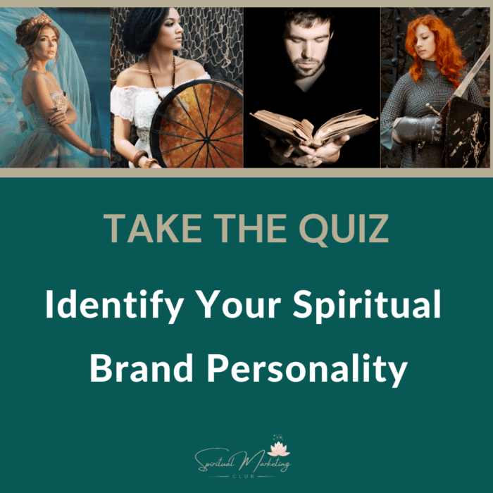
Too many spiritual businesses choose colours they are attracted to or need, not what their clients need. An important reason why I help spiritual business owners, healers, spiritual coaches and spiritual entrepreneurs identify their brand’s most dominant energy- To identify your brand’s most dominant personality and energy take my Free Spiritual Brand Personality Quiz.

This blog was originally published on 11th November 2016 and was updated on 6th Sept 2025


Great post Eileen! I chose purple because it is a colour people have always associated me with ever since I was a child. On the day I left one job, my colleagues all wore purple and played Purple Rain! Sian
Sian your probably very spiritual 🙂
Eileen Burns recently posted…Colour Psychology In Marketing Your Therapy Business
Thanks for sharing, very informative, what is aqua? That is the color I chose.
Because it is between the green and blue lighter, brighter shades it heals the emotions, calms the nervous system and supposed to help with focus, organisation and clear thinking 😉
Eileen Burns recently posted…Colour Psychology In Marketing Your Therapy Business
I chose Blue, and even my business name has the word blue in it lovely article Eileen!
Very apt emma very soothing and perfect with your business name
So interesting! Is it true that warm colors attract more people?
Hi Dr Dawn
It’s not quite as simple as that if you are referring to client attraction in marketing, Your colours have to represent the energy of the solution and energy of the service provider. So some types of products should be cool colours, others a blend it totally depends on a lot of factors
I use green for my (mental) health blog
Alex recently posted…Life is Beautiful Quotes by 20 Celebrities We Love
Yes the right shade of green can be extremely calming Alex
Great informative piece, Eileen. Thanks
Glad you found it beneficial linsey 🙂
So basically, my impulse buys are color-coded mind tricks? No wonder I always fall for those bright red ‘SALE’ signs! ️ This is some Jedi-level marketing magic. Now I just need to figure out what color makes me ignore dessert menus… though, let’s be honest, that might be an impossible task
Such a fascinating and insightful read, Eileen! I never realized just how deeply color psychology influences not only branding but also emotional connection with clients. I love how you explained the energy behind each color and how it ties into spiritual and archetypal branding — that really puts things into perspective for holistic businesses. The reminder that we should choose colors based on what our clients need, not just what we’re drawn to, was a powerful takeaway. Thank you for breaking it all down so clearly and with such practical examples!
Your breakdown of colour psychology in marketing is incredibly insightful, especially the way you connect tones and shades with emotional responses and archetypal branding. It’s a powerful reminder that choosing colours isn’t just about personal preference but about aligning energy, intention, and audience perception.